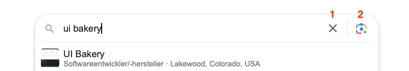
Input components: add clear button and placeholder for other actions
Hobli Taffame
Just like in the attachment it would be very helpful to have the following extensions to the input component (especially "Text Input"):
1- an "X" that only appears when users start typing in the input field. A click on the "X" button can clear the characters typed in. This should be standard and will definitely be very very helpful.
2- a placeholder for another icon button or component. In our use case we would additionally like to display a loading spinner there when an {{actions.searchAction.loading}} is true.